 Students/Staff
 Parents
 ElevatEd
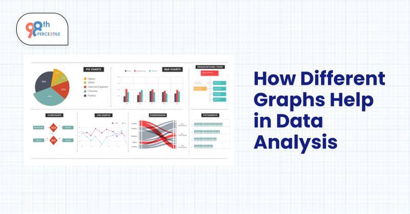
Graphs sound interesting... isn't it? But are you aware of the various types of graphs? Do you know how to use it for the best result? If not, don't worry because we will help you... but what is the role of graphs in data analysis? Data analysis and graphs go hand in hand in almost every sector. It helps in better comprehension and retention as it is a visual aid. From students to teachers or bosses, everyone relies on graphs for better understanding. So today, we will learn how different graphs play a role in data analysis.
Graphs are effective visual tools for comprehending and displaying data. They aid in the simplification of complex data, facilitating the analysis of comparisons, trends, and patterns. Graphs are essential for interpreting data in research, industry, and education. Various types of graphs have distinct functions, and understanding which to employ can improve the efficacy and insight of data analysis.
What is a Graph?
Graphs are visual displays of numerical data that facilitate information analysis and comparison. They support straightforward data presentation, trend identification, and prediction-making. With the help of graphs, we can turn uninterpreted data into insightful understandings that everyone can quickly comprehend. Our teachers at 98thPercentile use graphs for various reasons.
Different Types of Graphs
Let’s have a look at the different types of graphs and what they display-- Bar graphs are used to compare several groupings or categories.
- Line graphs help monitor progress since they display patterns over time.
- Pie charts show percentages and proportions of a whole.
- Scatter Plots show how two variables relate to one another.
- A histogram displays a dataset's frequency distributions.
How Various Graphs Aid in the Analysis of Data
Every kind of graph has a distinct function in the understanding of data-
- Bar graphs are perfect for business analysis and survey findings since they can be used to compare volumes across many categories.
- Line graphs are useful for monitoring changes over time, such as shifts in the stock market or temperature.
- Pie charts are ideal for showing population distributions or budget allocations since they divide data into proportions.
- Relationships between variables, such as those between height and weight in a study, are shown via scatter plots.
- By arranging data into intervals, histograms aid in the comprehension of frequency distributions, including test results for students.
Book Free Math Trial Classes Now!
Making use of the appropriate graph guarantees accurate and efficient data interpretation, which aids in decision-making in a variety of domains. By visualizing data, graphs facilitate comprehension and data analysis. Different graphs have varied uses, such as monitoring trends, comparing data, or comprehending distributions. Better data interpretation and decision-making in daily life are ensured by knowing which graph to use.
Learn about graphs and more with 98thPercentile’s extensive Math program. Try out our one-week free trial classes now by visiting www.98thpercentile.com.
FAQs (Frequently Asked Questions)
Q.1: What are graphs?
Ans Relationships, trends, and comparisons are made easier to understand with the help of graphs.
Q.2: Why are graphs used?
Ans: Complex data is made simpler by graphs, which makes information analysis, interpretation, and communication more effective.
Q.3: Why is a bar graph used?
Ans: By visually comparing several categories, a bar graph facilitates the analysis and interpretation of data patterns in statistical reports, sales reports, and surveys.
Q.4: Why are pie charts popular?
Ans: Pie charts, which are frequently used for budgeting and demographics, are well-liked because they facilitate the visualization of data distribution in an understandable circular style by clearly displaying proportions and percentages.
Q.5: What role do graphs play in the education sector?
Ans: Graphs make learning more dynamic and interesting by assisting teachers and students in data analysis, academic progress tracking, outcome comparison, and the visual simplification of difficult ideas.
Related Articles
1. Why Is One a Prime Number? Explanation and Controversy
2. Temperature Conversion from Celsius to Fahrenheit Formula
3. Exploring Types of Angles Including Congruent and More
4. Associative Property of Multiplication Explained